山行 Shánxíng - Mountain Flow
Services
Art Direction
Visual Identity
Client
山行 Shánxíng - Mountain Flow
Location
Antwerp, Belgium
Year
2025
Info
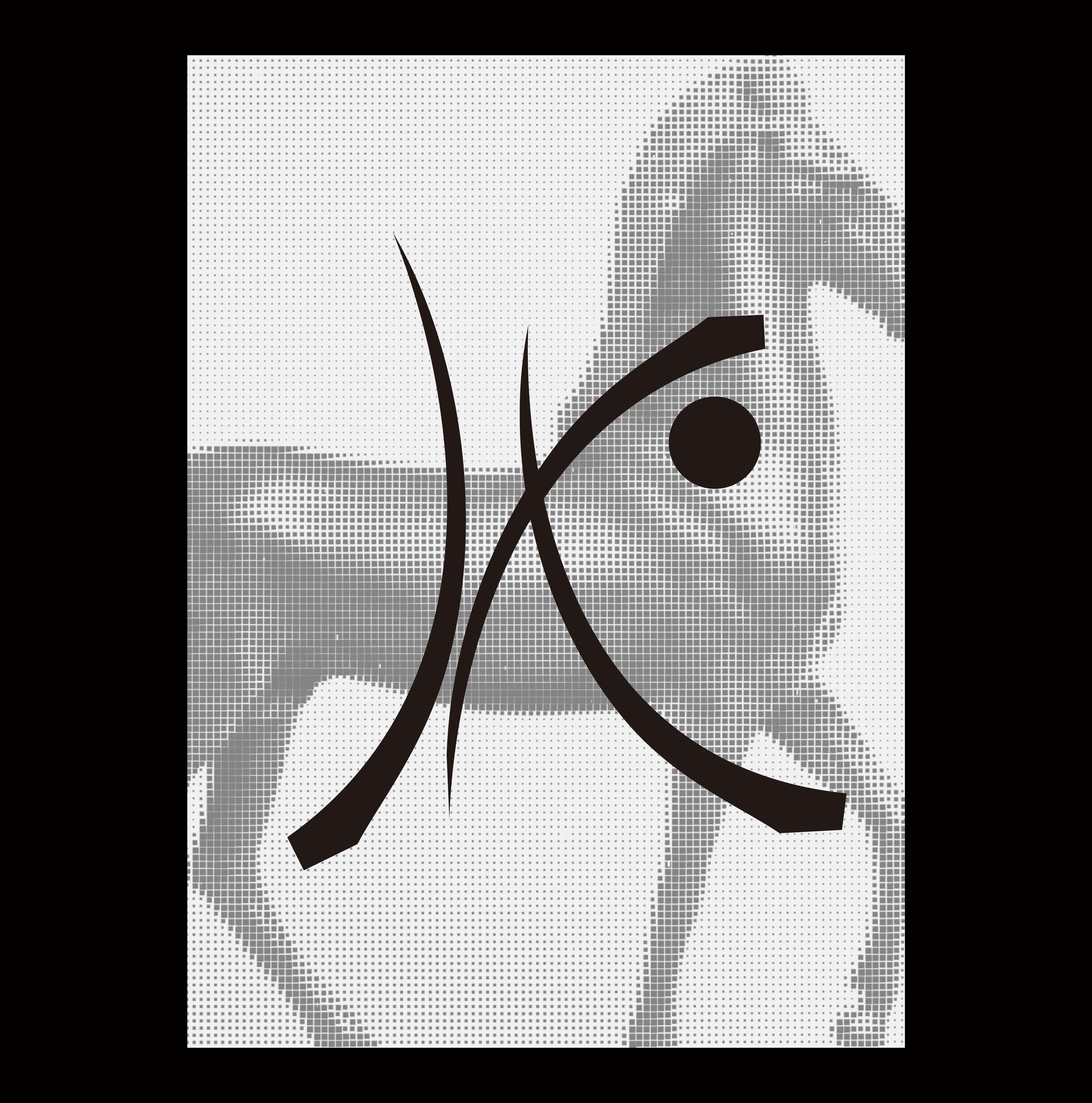
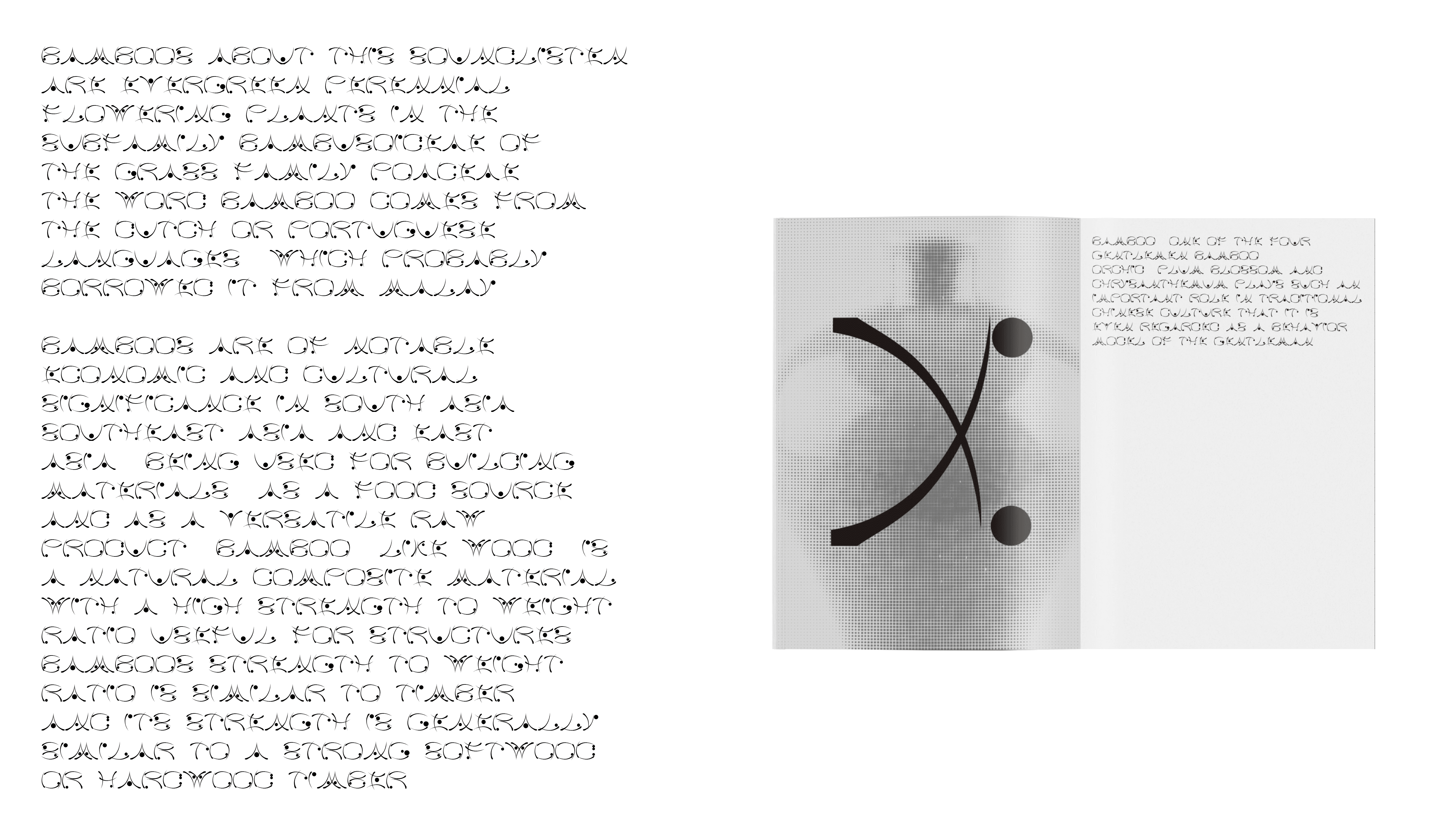
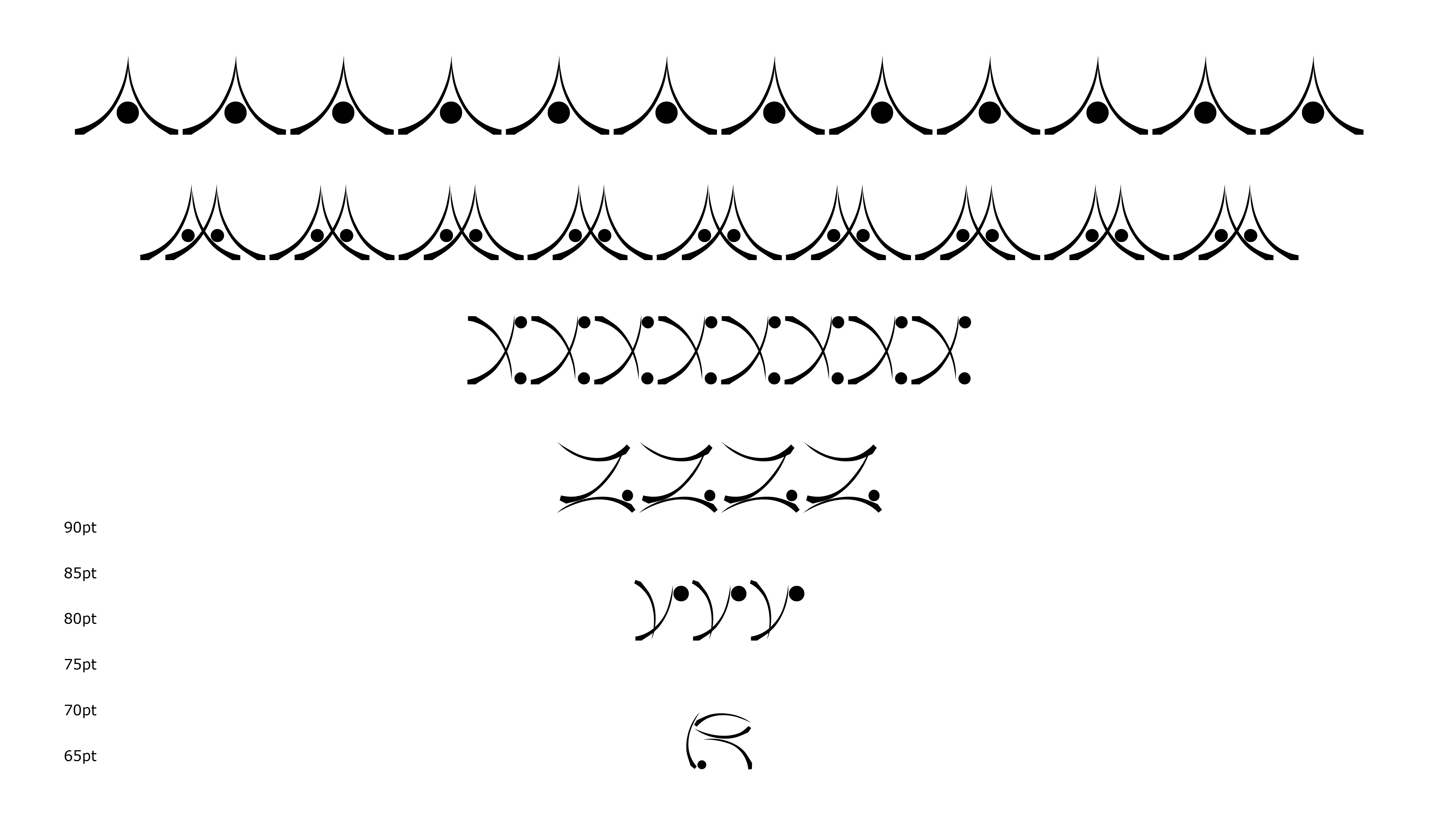
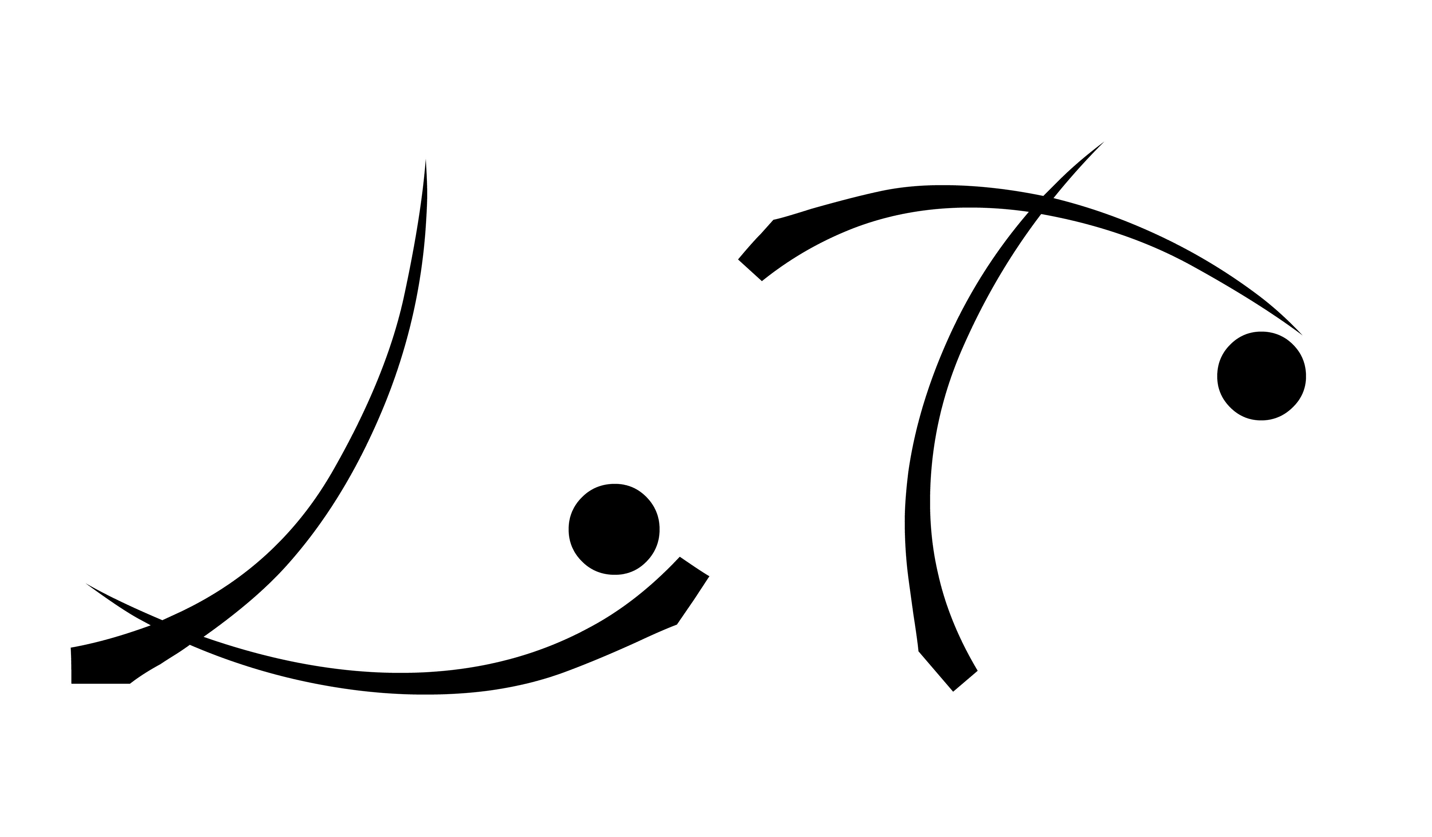
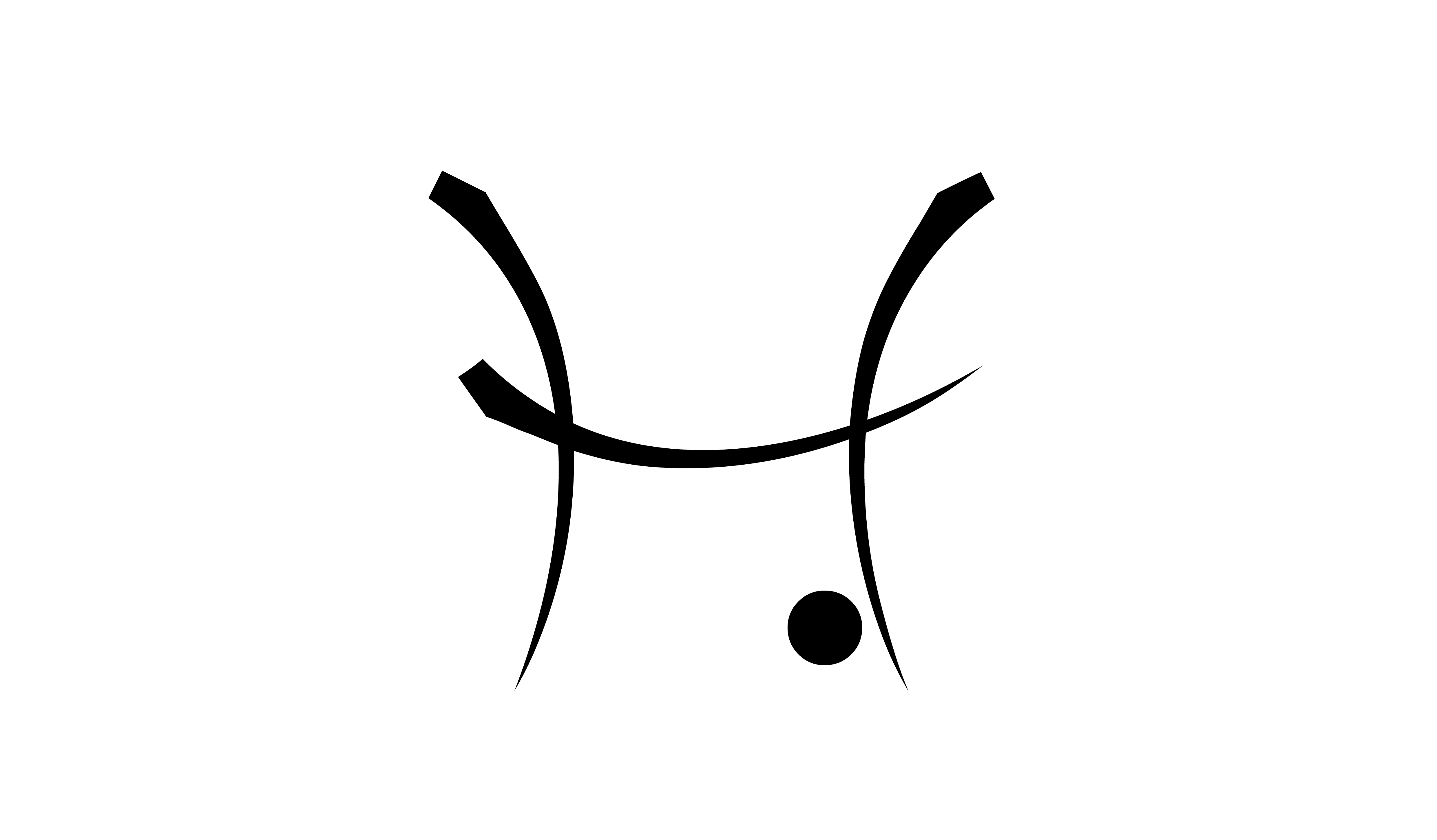
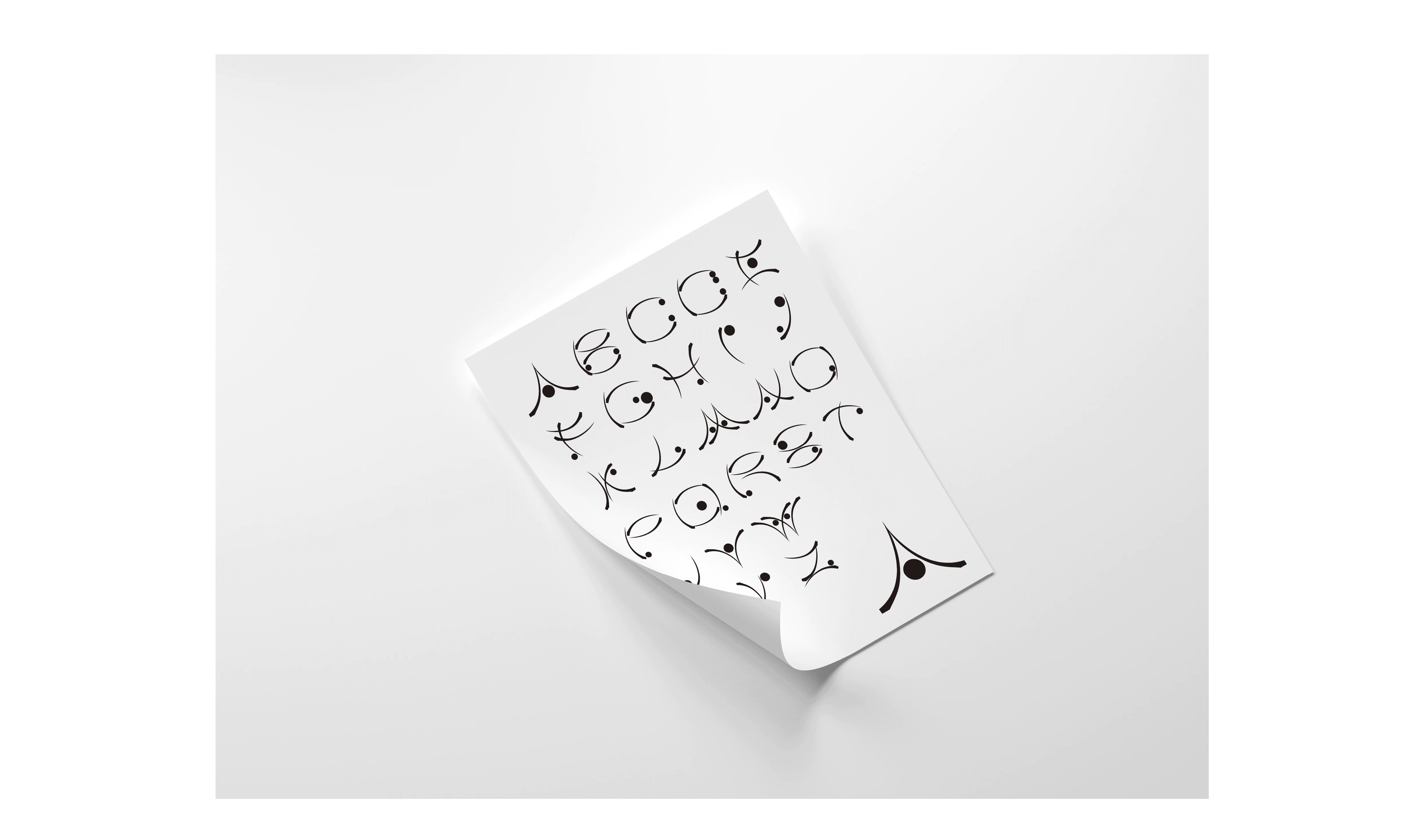
Typography is not only a tool for communication, but also a carrier of cultural identity and aesthetic philosophy. In Chinese calligraphy, each character embodies emotion and atmosphere, conveyed through the rhythm of brushstrokes and the nuanced interaction of ink and structure.This typeface design is inspired by the calligraphic work of Liu Zongyuan, a renowned figure in Chinese calligraphy. By deconstructing the traditional writing methods of Chinese characters, I explored the structural logic, spatial rhythm, and inherent visual balance of the script. The result is a typographic system that resonates with the expressive essence of Chinese culture.A key focus of this project is the material metaphor between letterforms and physical objects. For example, the letter "A" is envisioned with the strength and stability of a mountain, "X" embodies the elegance and fluidity of Tang Dynasty ceramics, while "K" conveys the upright force of industrial machinery like a Hummer.In terms of stylistic development, the typeface integrates the basic strokes of Chinese characters and takes visual cues from the segmented structure of bamboo. This not only reinforces the typeface’s oriental sensibility but also introduces a poetic tension between rigidity and flexibility—one that mirrors the duality of tradition and modernity.